Monday, August 31, 2009
First panel!
Well, not technically the first panel in the book, but the first panel that we've completed to its entirety with the new background techniques. This is the first panel of Maddie's fairytale story.
We're really, really excited about it. We had to concentrate on creating elements that we really loved, and everything is reusable in one manner or another. (Like I have mentioned previously, there are a LOT of backgrounds in this book. If we want to get it done in our lifetimes, we're going to have to be economical.) We have a pretty decent morgue going right now, so hopefully future panels will be more about designing than creating from scratch every element.
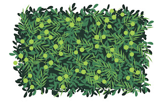
You can see where I've made use of the bush technique I showed in the last tutorial. However, the low bushes didn't make it into the page - it was too crowded and you couldn't see the trees clearly enough. I did use the same technique for the trees that go off into the distance, though (economical!). I had been searching for a good sponge brush for Photoshop for what seemed like forever, and then Durwin had the brilliant idea of, you know, sponging a piece of paper and scanning it instead of frustrating myself trying to find one that doesn't exist. Thus, we made the awesome brush that we used on the road. The texture is perfect.
I think my favorite thing about doing this page was the big tree trunks. They went through several iterations before finally turning into these. The trunks themselves are created in Freehand so that they're resizable and reusable (of course) and then brought into Photoshop as smart objects. For the bark, a bark pattern is created in Freehand, brought into Photoshop, and used as a selection template. I select the bark, go to another layer, and "paint" with a sponge brush. It gives me a lot of control but still looks rough and painterly. Each color is on a seperate layer so I can control everything untiil the very end.
This is the first time that our characters have been in color. It's really exciting to see them fully fleshed out. We're also playing around with colored line instead of the traditional black (also, colored line means no trapping!) and we're liking the effect of it. You can see the subtle dark rust of the Princess's holding line above. All the character's shadows are painted in Sketchbook after the inking stage and brought in after the colors are finished. It's ridiculously fast. And we like fast.
Personally, I frickin' LOVE it.
Wednesday, August 26, 2009
Cast of Characters - Ridley Age 6
In Beautiful Scars, we are playing around with multiple storylines. The main storyline is Ridley's past as he tells it to his granddaughter. His first story involves seeing a car (a Panhard 1902) and Emma for the first time. At the time of the story, Ridley is Maddie's age.
Ridley is a normal kid growing up in the English countryside at the turn of last century. An important character design feature is Ridley's hair style–it will prove to be a nice storytelling detail in the final issue. Knowing how characters evolve in a story inform character design.
Tuesday, August 25, 2009
Process: Silhouettes
To give you some insight to our character design process for Beautiful Scars, I pulled a panel that would work out beautifully as an example (it also happens to be the panel I'm working on). In this panel, the Princess sees her friend the Woodsman. She's about to give him a big ol' hug.
To me, the moment is about the action. And after channeling my inner Princess and posing the pose myself, I chose the moment where she would gather herself up to give her hug. In other words, she's not walking out like a robot, arms in the air in a hug-like motion.
First step is to go through an old Warner Brothers exercise and develop lines of action. ASIFA has a great handout I use in my classes pulled from the great Preston Blair book on animation. In essence, I use the fattest digital brush I have and lay down a core mark thinking about movement running through the character. I'll cheat and add smaller marks to suggest shape.
Second step is to use this gesture drawing as a base to sketch onto using layers. Making the lines of action a bit more transparent, I draw directly on the base sketch. I'm thinking about construction, silhouette and anatomy, but I'm constantly reminded about movement. To make a stronger character silhouette, I adjusted the rose to point down, but the energy still feels right. David Guertin always preaches clear silhouettes (and now I do too!), and all of the important details are an easy read at this stage even if I deleted all of the internal information.
The last step is to ink. Sometimes, the penciling stage will get tighter if I'm nervous about details. But I feel if you over pencil, then you lose all your energy on the inks stage. Taking a cue from Bruce Timm, I try to push my line as far as I can. Inking almost becomes a game... Can I define an entire arm in one stroke? Inks = Energy!
The process for this book is pretty loose, but I think the effects are worth it. Having gone through a book where everything was SOOOOO TIGHT (Bonds), it's nice to relax and enjoy the act of drawing again. Guin is constantly pushing me to be looser and looser and I hope it shows in this book. More later!
Friday, August 21, 2009
Bonds #3
Funny how warped time can be. I've been so focused on Beautiful Scars, that I almost forgot I have another comic book coming out!
On September 2, Bonds #3 wraps up through Image Comics. This was a book written and illustrated by me (though Guin was a stalwart on separations and my buddy Scott Hampton edited my ramblings).
There was so much emotion involved with this comic, but like being rushed by endorphins after a pregnancy (I imagine), I barely remember the trials and tribulations. For now, my focus is on Scars and the work makes me content.
If you pick up Bonds, I simply hope you enjoy the ride.
Thursday, August 20, 2009
Cast of Characters - Emma Sargeant
We're nearly at the end of our character introductions! This is the last major character. Introducing Emma Sargeant!
Emma is the lifelong love of Ridley. This is obviously her little girl self, but her character grows alongside Ridley's to adulthood. She is a wise little girl that sees Ridley for who he is and loves him for it. Eventually, she becomes Maddie's grandmother.
Her design is classic. She looks like a porcelain doll to me. Her design is definitely more old-fashioned than the little girl look of Maddie, but this reflects her personality and helps to establish her story setting. I think she's just beautiful!
That about wraps up our introductions. We still have some minor characters to go, but now you are acquainted with the "who's who" of Beautiful Scars. Be on the lookout for more design notes and another tutorial soon!
Wednesday, August 19, 2009
Cast of Characters - Ridley Bourne
Ridley is the heart of the Beautiful Scars. A man born in 1890, he has been able to experience the first cars, the first planes and the first World War. When he sits down with Maddie in his garden, he is already in his 60's. On his forehead is a scar that makes Maddie nervous.
But every scar tells a story.
In telling the tales of his scars, Ridley shares his experiences of falling in love with Maddie's grandmother. He also shares his experiences in World War I. Maddie, in turn, is inspired enough to create a fairy tale land where the brave Woodsman tries to protect the Princess and accumulates the exact scars her grandfather has.
Ridley's character design is an interesting one. He is Maddie's age when he first meets Maddie's grandmother. And he is a pilot in the War. Research on fashions is key! Ridley has a little bit of the swashbuckler in him, but he's also pretty humble. We'll be sure to share his design evolution with you.
Friday, August 14, 2009
Games and Workshops
Just a quick note: Guin and I are in Indianapolis attending GenCon this weekend.
Beside comics, Perpetual Flights also creates boardgames. We will be testing out a naval battle game this weekend and making notes and adjustments. Stay tuned for more details on this venture!
Also we'll be hanging out with our buddy Chris Moeller. Not only will we be gaming, but we are going to discuss a series of comic book workshops that we will be holding next summer with a few of our cohorts! These workshops will teach digital and traditional media with an emphasis on comic book storytelling. It'll be professionals teaching their methods and storytelling to people looking to break into comics. Again, stay tuned!
Next week, more Beautiful Scars process. Talk to you then!
Monday, August 10, 2009
Process: Bushes
Well, I was going to wait until another day to put this up, but I'm on a roll here! So let's do this thing!
Like I mentioned in the last post, we've been doing some awesome backgrounds inspired by old-school Disney. We have been looking especially at concept work by Mary Blair and Eyvind Earle for inspiration. We really want our characters to inhabit an awesome, unique world. I think this is a fine way to achieve that goal. I think I have nailed down a style that I really enjoy, so I'd like to share the process with you all.
First and most importantly, I started by figuring out my palette. Usually I'll pull some from a photo or go hunting for inspiration on Colour Lovers for a good starting point. (I overload on colour choices way too readily, so limiting myself at the beginning is a definite necessity for me.) This is what I decided on:
(The colours are a little wonky, converting from CMKY to RGB, but you get the basic idea.)
For this exercise, I am creating a bush that will be used somewhere in the foreground, so the colours are stronger and have more contrast among each other than I would choose for trees in the distance, for example. But, this works for my purpose, so forward we go!
I'm working in Photoshop on a Cintiq so you have a point of reference. I want to be able to use and re-use these bushes (did I mention how many frickin' forests and outdoor scenes there are in this book?) so I created a file that is 6" x 6", at 300 dpi. I don't think I'll have an instance where I have a full page shrubbery so this should be more than enough.
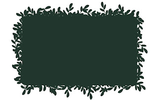
Then, I make a shape, using my darkest colour, like so:
Very hard, right? :) I keep each component to this sucker on its own layer, that way it's very easy to change things around if you need to. This is just a basic rectangle for a low bush. I rounded the corners with the eraser, mostly because I dislike hard corners. The corners don't really show in the final product.
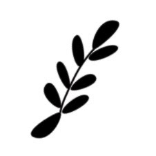
My next step is to make it look like a bush. I have a lot of leaf brushes in my arsenal, but it's very easy to make your own customized ones. Just draw your leaf shape in black on a white background, then go to Edit>Define Brush. It'll show up at the end of whatever brush palette you happen to be on at the moment. Easy peasy. This is my basic fern sort of brush:
See how it's the same on both ends? It's important because I set the brush to "scatter" and also I turn "angle jitter" on, so the brush gets flipped around randomly as I draw with it. I didn't want a bunch of stems sticking out (although sometimes it's a neat effect) so some kind of symmetry was important.
So, I select my nifty brush and go around the edges of my rectangle with it, careful not to let too much or too little show. I'm still using the darkest colour at this point.
I don't really like how all of these guys ended up scattering around the edges, but I'm not going to worry about it right now. It might be good later when I get the other layers on. I'll also turn off scattering and jitter occasionally to pinpoint an area that needs it.
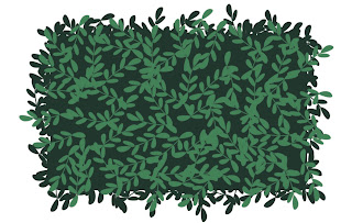
Okay, my basic layer is done, so I'll select the next darkest color and hit it again with the same brush:
Here you can really see the scatter effect of the brush. I have my pen pressure determine the amount of scattering, I'd definitely take advantage of this if you're working on a tablet.
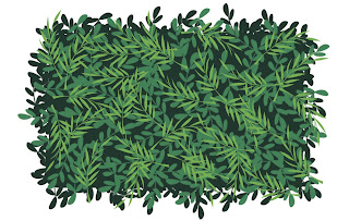
For the next layer, I'll choose a different brush to mix it up a little. I went with a sort of wispy frond brush, and sized it bigger than the one previous. Choose the next darkest colour and...
Oh yeah, I like that! I'm just going for good pattern and shape here, definitely not realism. Some of these little leaves and stems are really bugging me, so I'll take my eraser and clean up what I don't like.
For the last step, I want to choose a fun brush that will be, well, fun. It's a fun little decorative element that makes it have personality. I went with a nice berry-like brush for my lightest colour. I didn't want too much, though, or else it would look too over-done. If they're on different layers, though, you can go back and tweak as much as you like.
And here is the final product!
Hooray! It's a bush. I like it!
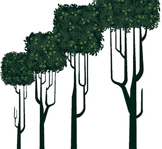
Here's a sneaky peek at the same process applied to trees:
Fun shapes extend to the trunks. You can also see there is a lot less contrast in the palette for the leaves.
Next time: more characters!
Cast of Characters - Maddie Bourne
Let me introduce you to our spunky young heroine, Maddie! (Apparently, we like the spunky.)
Maddie is the granddaughter of Ridley and Emma Bourne. She is a precocious 6 year old with a big imagination, always creating fantastical worlds and characters in her notebook, three of which have already been introduced. She is a dreamer and a very curious child. At the beginning of our story, Maddie is afraid of her scarred grandfather, but then learns to love the stories behind the scars. Their mutual love of storytelling brings them close together, and she eventually grows up to be a writer.
Maddie's character design is fairly straightforward. She is growing up in England in the 50s, but we wanted her clothing design to be of the period but also a little more timeless. She wears a very simple dress with a peter pan collar and little mary janes, which could work in other time periods. Her short bob reflects her adventerous spirit, instead of dealing with a more fussy long style. She's a very expressive child, and very cute! I really fell in love with her, and I think Durwin has as well.
In other PFS news, we've been working on developing a style for our backgrounds. We've been looking at old Disney for illustration, and a recent trip to Disneyland was very inspirational. We've been looking at things like Sleeping Beauty and the work of Mary Blair (my most favorite illustrator ever), and have been working on tree and background designs based more on shape and pattern than realism. It's coming along really great. Actually, I'm a little bit in love with it as well (there's a lot of love in this studio!). I'm going to create a process demo soon to show you how it's done. In the meantime, stay tuned for more character introductions!
Labels:
character design,
character introductions,
inspiration,
Maddie
Friday, August 7, 2009
Cast of Characters - The Woodsman
In Maddie's imagination, the Woodsman exists to protect the Princess. He has a brave soul and a courageous heart (which is captured by the Princess). He's a man of action capable of taking on dragons and trolls alike. In the end, his derring do will allow him to slay dragons, but his decency will also allow him to create unexpected friends.
His costuming is pretty simple: tunic, cloak, and axe. It reflects his humble occupation. However, he will eventually elevate his rank, and inherit an elaborate suit of armor. We tried to keep his facial features angular and his hair a bit shaggy (dare I say Beck-tastic?). Since he appears in many scenes with Scars, Guin and I wanted the Woodsman's angularity to counterpoint the Troll's broad silhouette.
This wraps up the major players for the fairy tale. Next up, Maddie's family!
Labels:
character design,
character introductions,
Woodsman
Wednesday, August 5, 2009
Cast of Characters - The Princess
Here's another introduction – we're slowly making our way down the list.
Let me introduce you to the Princess. She's the dear friend of Scars, and lives in the land of Maddie's imagination (whom you'll meet later!). Beautiful, kind and resourceful, she is the target of an evil presence in the enchanted forest, and must rely on the help of her friends. For character design notes, she's got some interesting features to her hair and costume design that make for really great silhouettes. Her hair starts out in braids which come undone as her trials escalate, and an interesting dress design inspired by tulips. She makes me think of a tulip: vibrant, beautiful, but not overly delicate or in need of special gloves to handle.
I really enjoy this character. I really wanted to make sure our princess character wasn't just some damsel in distress, but is her own person. I remember reading a fantastic series of princess stories growing up where the princesses were resourceful, sassy, kind, and funny, and they were infinitely more interesting than the ones who laid around waiting for a prince to show up. Even though she isn't the main focus of the story, I really hope some of that spunk made it into ours!
Monday, August 3, 2009
Cast of Characters - Scars the Troll
So as you may have heard, Guin and I are working on an all-ages comic for Archaia Studio Press entitled Beautiful Scars. We will be using this Blog to invite everyone out there to join in the fun us as this project gets finished.
But for now, it's my job to introduce you to the characters.
Scars the Troll is the title character. He's a rough and tumble character with a heart of gold. As far his character design notes: he's a big character with spikey bits to make him seem more ferocious. However, he does wear ribbons in his hair, so he's kind of a softie! BTW, I feel that sideburns are like a character design good luck charm... it worked for Wolverine.
It is Scars' job to protect the Princess in Maddie's imagination. More to follow!
Sunday, August 2, 2009
2009 SDCC Portrait Challenge
Guin and I have this game where we'll draw shapes and the other artist will turn it into something. It's a lot of fun if you've never tried and especially great in restaurants where the table cloth is paper and the crayons are plentiful.
At San Diego Comic Con this year, people walked up to me to check out A.) My Cintiq tablet, B.) Sketchbook Pro and finally C.) BEAUTIFUL SCARS which I was working on. To explain A and B, it seemed demos made the most sense, so I accepted the Portrait Challenge:
Rules–The observer drew a shape on the Cintiq. The wilder the better. I then created a layer in Sketchbook Pro and turned it into a portrait. I gave myself no more than 3 minutes to complete the image. Think con sketches but digital.
This made the weekend go by a little quicker with a little more fun! Next year, I plan to do the same. Enjoy!
Labels:
cintiq,
comic con,
friends,
portrait challenge,
sketches
Subscribe to:
Posts (Atom)