Friday, December 25, 2009

Merry merry!


A very happy holiday season to all of our readers. Thank you all so much for reading our blog and following our journey! See you all next year! There's mulled wine calling my name...

Friday, December 18, 2009

OUTLET Magazine

Whew, it's been a while since we've posted! I do apologize. We've been running around between multiple states, landing in Indiana to visit friends and family. We spent some time in the triangle in North Carolina with friends, ran off to a mini-vacation in Boone (frigid hiking!), and are now in the chilly midwest. Snow is predicted tomorrow. I am thrilled!

I wanted to mention that Durwin and I are featured in the premiere issue of OUTLET Magazine, a brand new publication in Savannah showcasing local artistic talent. We talked about Beautiful Scars, and there are some favorite pages showcased.

About them:
Founded by graphic designer Britt Scott and writer and editor Laura Clark, Outlet magazine is a not-for- profit publication offering Savannah’s creative community an open forum through which to view and display art of all makes and media. As a submission-based magazine, Outlet’s goals are to encourage creation, connect local artists and assist in the emergence of creative careers.
We're very excited to be featured alongside some fantastic local talent! Thanks, OUTLET!

Now, back to your regularly scheduled programming!

Monday, November 30, 2009

Page 11 - With an adorable dog, even.

Hello all you lovely people! I hope everyone had a great Thanksgiving. Ours was spent quite well, in the relative warmth of Florida, and it was a nice trip. Too much food, of course. 

This week in the studio, we're trying to get a lot of work finished before the craziness of holiday travel is upon us, and I think we'll be able to do that.

This should be a familiar page as well. The bottom panel is the first panel that we completed, I believe. It was such a struggle to get our style down, and to be cohesive, but it's been much easier since then, now that we know what we're doing. Heh. The top panel was much easier to create, since we took the tree form from the bottom and have a pretty good morgue of foliage going. We had to create that frickin' adorable beagle, though. Norman Rockwell would be proud.


Monday, November 23, 2009

Page 10 - Halfway and then some!

Wow! I was so looking forward to reporting our halfway mark, and now it's a spot in our rearview mirror. We're pretty far ahead, so hopefully we can stop working long enough to catch the blog up to where we are.

You might remember the top panel from this post, but here is the completed page. I love seeing the two panels side by side. It's a pretty darn good-looking page, if I say so myself. I love the close-up of the princess, especially with that dramatic far-away scene.

I don't have so much to say right now. It's been a lot of working over here, and my brain is a little fried. Last week was spent in Pasadena, with the Hartford Art School, and I got some great inspiration, especially with a visit to the Disney Archives. Original Eyvind Earle and Mary Blair pieces, right in front of me! So amazing. How could you not want to come back and work, honestly?

My dear counterpart just finished the quarter for the holiday break, so we're having some quality dual working time lately, and I'm taking advantage of it while I can! We'll be updating soon, though, so stay on the lookout!

Thursday, November 12, 2009

Page 9 – A New Chapter


This page begins the story behind Ridley's scars. We wanted the book design to reflect both comics and children's books with these chapter breaks: the Knee, the Elbow, the Hand, the Forearm and the Forehead. A block of narrative text will connect the spot illustration to the panels underneath.

We started with the knee because EVERYONE we know has a scar on the knee. It's the price of growing up. The staging of the actors on this page is important, because we intentionally place grandfather and granddaughter apart from each other. They are cordial, but not overly affectionate. As we progress in the chapters, they will interact more.

Art-wise, I personally like their head shots–they both show a lot of personality. Maddie is cute as a button and when Ridley smiles it's like the sun peaking out of the clouds...

Monday, November 2, 2009

Page 8 - Beginning of a story


This is really the page we were working on in North Carolina...it just seemed more appropriate to talk about on the last page, given the subject matter!

I love how Ridley's face goes through the same processing as Maddie's did when she hurt her knee. And when he realizes he can turn around his hurt feelings into a special moment with his granddaughter. Again, a fairly simple page to do, but the characters are beginning to connect with one another, so we like it!

Looking at it, it seems like the ground might be a little too sparse in the middle panel. Maybe we need to add some flowers or a few more bunches of grass there. Other than that, I like it. And we get to start on the two-tier storytelling pages after page 9, which will be SO MUCH FUN. I can't wait to start drawing forests again!

Also, you can see that we've started watermarking our images. When I have more time, I'll go back and watermark the ones that are already up. The issue of watermarking has been nagging me lately and it was brought to our attention last weekend that we really should be doing it. It's the trouble with posting work online – I'm not so afraid that someone would steal it (low-res and a poor file format for printing anyway) but we'd like people to know where it came from if it shows up somewhere else. So, we're gonna try this out.

So close to halfway I can almost taste it!

Monday, October 26, 2009

Page 7 - Finding a Connection

We just keep rolling along... three more pages and we are at the halfway mark!

This page shows the first real interaction between Maddie and her grandfather. She's upset about her knee because she doesn't want to end up scarred like her grandfather. Being a child, she doesn't know what kind of impact her words have on him. However, he notices her book and sees that she is a storyteller, like him. 

This was a simple page to do, but it's one of our favorites. The interaction between the two, the quiet moment of hurt that Ridley has, the flow of the page, we are really happy with how it all turned out. I think we love it so much because this is the beginning of them finding their connection. This past weekend, we spent in North Carolina reconnecting with our "art family". It was much needed, two days of talking art and comics and board games and even a little work thrown in. Life is all about connection, it's what it comes down to. So, we're loving to see our characters start to connect as they come to life. 

We did have a scary moment where we thought we had lost the entire page, though. (We're using dropbox to share files between us now, but we need a better solution, any suggestions? I was thinking about a shared hard drive but if you have something better, let me know!) Fortunately, it magically appeared on one computer and not the other. That was a heart attack and a half! We seriously need a better solution, I'm wondering what all of you use...

We're really excited to start working on the "fun" part of the book soon...with princesses and trolls and whatnot. Looking forward to that immensely! 

Thursday, October 22, 2009

Page 6 - Run away, run away!

In this page, Maddie runs terrified from her well-meaning grandfather, trips in her haste to escape, and scrapes her knee. I really love how she checks out the damage before crying. So kid-like. Her face in the center bottom panel is pretty priceless. Maddie is none too happy about that scrape on her knee, which you'll learn about in the next page.

This was a nice, simple page to get done. It's very character-driven, so the background detail is at a minimum - just enough to suggest their setting. So glad we could use that willow tree again, though. I really like it!

In studio news, we spoke to our publisher at Archaia and it looks like we are going to have an April release. Even though we'll be done with this issue in about a month (if we can keep our current schedule going), he wants to make sure it is marketed properly before it comes out. Which is great! Also, both of our birthdays are in April, so it's fitting that this project's birthday will be in April, too. It seems like a long time, but we'll be bringing you LOTS of good stuff before then! And this blog serves as a great tool to keep on target.

Thursday, October 15, 2009

Page 5 - The Granddaddy of all Dragons

Maddie, deep in her sketchbook, narrates a thrilling tale of evils dragons, eviller ogres and the fair princess and noble woodsman. And then her grandfather says hello.

This page sets up the relationship between granddaughter and grandfather. And this relationship isn't as warm as Maddie's relationship with her grandmother.

I like how dapper Ridley is, and how the sun shines behind him. Also, the children's drawings are kind of adorable--I wish I could draw like that! The sun should never be sad...

Monday, October 12, 2009

Page 4 - Notice a pattern here?


Or two, or three...on the walls, on the aprons...

I love vintage patterns, linens, prints, aprons... I think I stressed out more over the pattern for grandma's apron than I did over any of the characters' designs. It's important to keep the appropriate tone of the time period for our characters, so a lot of research went into making sure the patterns and furnishings are believable. I found this great vintage 50s apron (which I absolutely covet) and used the pattern for grandma. Mom got a little more fun design with a random geometric pattern. I love that wallpaper, taken from a 1940s print. I figured that the grandparents would probably be slower to update their trends. The little touches like the cuckoo clock and china cabinet just make it feel more lived-in to me. I want to go there and make cookies.

The willow tree in the garden is probably my favorite tree to date. The ivy was a lot of fun to create, more playing around with patterning and layering of custom brushes in photoshop.

I love how we get to see Maddie's playfulness and curiosity begin to come out in this page as well. Outside with you, girlie!

Now, I have the strange hankering to go tie on an apron and put my hands in flour. Side effects of comics? Hmm.


Friday, October 9, 2009

Page 3 - Maddie's Sketchbook


Maddie's sketching is the conduit into our fantasy storyline. Within this red notebook's pages are dragons, princesses, heroes and ogres. A creative mind, Maddie can always be found sketching and these drawings set the tone for this fanciful backdrop.

In this page, Maddie pulls into Albersfield Station to meet up with her grandmother. It's early morning when they arrive but it's never too early for hugs. By the way, you can never have too many fedoras in a scene.

On a creative note, it was hilarious to watch Guin draw the top two panels... Watching her draw with her opposite hand clutching a China Marker on bristol board is one of those memories that will live in infamy. The things we do to tell stories!

Wednesday, September 30, 2009

Page 2 - Train Ride to Albersfield

It's been an interesting challenge working a full-time job (me), working on grad school (Guin), finding balance in our lives, and creating a comic book on top of everything. But we will try to post pages in consecutive order in various stages so that you have an idea how the story unfolds.

The first panel is a pick up from the last panel on page 1. Maddie is a child accompanying her mum to the country. You can tell that she's not particularly happy about visiting her grandfather, but her mother is having none of it.

Flashbacks must be planned. For our flashback, we simply repeat the pose from the preceding page and use the leaves in the sky to connect the narrative moments. I love the third panel–where Maddie is fuming. In illustration you can take chances like this to heighten a moment. This panel still has about 10% left to go: an eagle drawn by Maddie in the last panel will connect this page to the next page.

Friday, September 18, 2009

Page 1 - Finished


And here we have the final image!

There weren't a ton of effects to deal with on this page. Just some leaves and clouds, and the shadows. We decided that autumn would be the most appropriate season for this part of the story, so the color palate is bluer and more subdued outside. The orange and gold leaves give it some depth and a little bit of movement. It's amazing what a little bit of added spice can do for a page!

Phew, page 1 is done! Now only...a lot more to go. Aw man!

ETA: Just adjusted a few things. The leaves and such. NOW it's done!

The Page is Flat

Page 1 with flat color–it cleans up nice and pretty.

This is an important stage for us as we get to establish scene and mood. For the interior shot, we were thinking 60's and 70's color theory... you remember, avocado or mint green walls (though we also played with goldenrod and rose) contrasting against a lot of maple. Contrasting the warmth of the shot, we see Maddie walk to her car (a 1964 Volvo 122s) and the skies are cool grey outside her flat (a typical row house in the city).

At this point, with everything set, it's time to add our shadows and effects.

Onward!

Wednesday, September 16, 2009

A Naked Page

Oh, not like that. Come on now.

Last post showed the first panel of this page, with Maddie's typewriter. Here, you can see the whole first page, with just inks.


It looks kinda, well, bare without the color. But, there's some charm and movement in the inks that I really enjoy. The grownup Maddie went through several costume changes, as it were. It is the 70's after all...we had a lot of interesting options as far as her hair and outfit. She even started out with a pseudo-Farrah hairstyle, but we both decided that it was too fussy for our girl. Besides, how can you go wrong with Dorothy Hamill?

The backgrounds on this page are going to be done with color and pattern work. Sometimes it's nice to see the naked image, without all the fuss and fanciness. At least this gives you an idea of what we start with, and you'll see soon where we end up. When it's finished (and I hope that's really, really soon, that deadline looms!), we'll share it here.

Friday, September 11, 2009

Environments - Maddie's Desk

Sometimes you don't need a ton of color or special effects to tell a story. So here are the inks, as simple as they can be.

In case you are wondering, we are jumping around a little bit when creating the art for Beautiful Scars, but this is the opening panel to the series.

A simple panel, really. Just establishing where an adult Maddie spends her time. She's surrounded by her typewriter, her books, and her notes. It's the photo of her grandfather that I especially like–it's like he is in the studio with her every day. There's a nice vibe to this panel and we thought it would be good to share unpolished artwork as well.

The main theme of Beautiful Scars is to connect to people you love. This weekend we are shutting down the studio to spend some time with my brother in Orlando... Happy Birthday Rob! Especially in lieu of today's date, we are glad to be hanging out with family and friends.

See you next week!

Monday, September 7, 2009

Environments - Albersfield

Environments. The stage where your characters come alive.

For us, this panels sets up a couple main storytelling details (and a small one)... Ridley journals, much like Maddie does at the same age. They are also both left-handed (re: creative) which also ties parallels to each others' lives. Ridley would have to be pretty stubborn because most school teachers would try to force left-handed students to write with the "correct" hand. We like stubborn. (Oh, and Scars the Troll also sports a ponytail and ribbon like the two school girls).

Ridley is raised in an imaginary hamlet called Albersfield. The concept is inspired by Westerham, a small town in England. It boasts a small clock tower, an abbey, Winston Churchill's family home, and an air field, the Biggin Hill Aerodrome. We needed to create a small country town in the middle of nowhere because they will need land and workers to build an aerodrome to train pilots in World War I. The clock tower is an important storytelling detail and is based on a clock tower found in Aberystwyth, Wales.

We also set out to create a lush woods and rolling hills. The turn of the century was a pretty innocent time, and we chose to portray a town unspoiled by the industrial revolution. When we open the scene, the town is about to welcome its first mechanic. So in other words, we wanted to set up two sides... a developing town and nature still in it's glory.

We wanted to draw idyllic. So here you go!

Thursday, September 3, 2009

Paying homage

Shadow, 1993(?)-2009

Once upon a time, there was a cat.

Well, perhaps I should back up a bit.

One of the best things about makin' comics is the fact that we can put the people we love into the work. Take Bonds. Practically every character in there is someone special. Comics are a great way to use our friends as inspiration. Even if they are far away or no longer with us, we can stay close and pay homage.

Our friends Glen and Elizabeth lost their dear cat this week. It really broke them up, as you can imagine. Losing a pet is like losing a member of the family. Shadow was an excellent cat. She lived a long and good life with her people, and I know she meant the world to them. She had real personality, and fought a good fight through some tough health problems. She hung on for a long time. And now she's gone.

We wanted to pay homage to the kitty, and to our friends who loved her. We decided to put her in the book, even if it's just for a few panels.

Shadow, this is for you.

Good kitty.

Bonds – D-Day +1

(Durwin in front of Home Run, Savannah GA, Sept. 2, 2009)

Today was my personal D-Day. The release of the last issue of my first creator-owned project.

I've had my drawings printed on all sorts of projects for years, but this is so much more satisfying. This was my own characters in my own story in print. It's in a form where my friends can pick it up as far out as San Jose (thanks Jen!), Atlanta (thanks Markus!), and Frederick (thanks Abbie!)–I don't have to make special preview copies on my tired Epson printer just for people to read it.

Production was completed so long ago (May). And the artwork and story was finished earlier than that (April). It's weird that I finally get to see it with staples and an SKU barcode. It took three tries to finally get the book in my hand (thanks to the good folks at Home Run in Savannah), and I don't think I breathed once while I scanned the pages for color problems or typos. But now I'm exhaling. I may be even exhilarated!

Thanks to everyone for your words of encouragement. I think the panels Guin and I are working on reflect all of your positive energy. And more importantly, thanks for being patient!

So without further pomp and circumspection, on to the next post: more Beautiful Scars work–I promise!

Monday, August 31, 2009

First panel!


Well, not technically the first panel in the book, but the first panel that we've completed to its entirety with the new background techniques. This is the first panel of Maddie's fairytale story.

We're really, really excited about it. We had to concentrate on creating elements that we really loved, and everything is reusable in one manner or another. (Like I have mentioned previously, there are a LOT of backgrounds in this book. If we want to get it done in our lifetimes, we're going to have to be economical.) We have a pretty decent morgue going right now, so hopefully future panels will be more about designing than creating from scratch every element.


You can see where I've made use of the bush technique I showed in the last tutorial. However, the low bushes didn't make it into the page - it was too crowded and you couldn't see the trees clearly enough. I did use the same technique for the trees that go off into the distance, though (economical!). I had been searching for a good sponge brush for Photoshop for what seemed like forever, and then Durwin had the brilliant idea of, you know, sponging a piece of paper and scanning it instead of frustrating myself trying to find one that doesn't exist. Thus, we made the awesome brush that we used on the road. The texture is perfect.


I think my favorite thing about doing this page was the big tree trunks. They went through several iterations before finally turning into these. The trunks themselves are created in Freehand so that they're resizable and reusable (of course) and then brought into Photoshop as smart objects. For the bark, a bark pattern is created in Freehand, brought into Photoshop, and used as a selection template. I select the bark, go to another layer, and "paint" with a sponge brush. It gives me a lot of control but still looks rough and painterly. Each color is on a seperate layer so I can control everything untiil the very end.


This is the first time that our characters have been in color. It's really exciting to see them fully fleshed out. We're also playing around with colored line instead of the traditional black (also, colored line means no trapping!) and we're liking the effect of it. You can see the subtle dark rust of the Princess's holding line above. All the character's shadows are painted in Sketchbook after the inking stage and brought in after the colors are finished. It's ridiculously fast. And we like fast.

Personally, I frickin' LOVE it.

Wednesday, August 26, 2009

Cast of Characters - Ridley Age 6


In Beautiful Scars, we are playing around with multiple storylines. The main storyline is Ridley's past as he tells it to his granddaughter. His first story involves seeing a car (a Panhard 1902) and Emma for the first time. At the time of the story, Ridley is Maddie's age.

Ridley is a normal kid growing up in the English countryside at the turn of last century. An important character design feature is Ridley's hair style–it will prove to be a nice storytelling detail in the final issue. Knowing how characters evolve in a story inform character design.

Tuesday, August 25, 2009

Process: Silhouettes

To give you some insight to our character design process for Beautiful Scars, I pulled a panel that would work out beautifully as an example (it also happens to be the panel I'm working on). In this panel, the Princess sees her friend the Woodsman. She's about to give him a big ol' hug.

To me, the moment is about the action. And after channeling my inner Princess and posing the pose myself, I chose the moment where she would gather herself up to give her hug. In other words, she's not walking out like a robot, arms in the air in a hug-like motion.

First step is to go through an old Warner Brothers exercise and develop lines of action. ASIFA has a great handout I use in my classes pulled from the great Preston Blair book on animation. In essence, I use the fattest digital brush I have and lay down a core mark thinking about movement running through the character. I'll cheat and add smaller marks to suggest shape.
Second step is to use this gesture drawing as a base to sketch onto using layers. Making the lines of action a bit more transparent, I draw directly on the base sketch. I'm thinking about construction, silhouette and anatomy, but I'm constantly reminded about movement. To make a stronger character silhouette, I adjusted the rose to point down, but the energy still feels right. David Guertin always preaches clear silhouettes (and now I do too!), and all of the important details are an easy read at this stage even if I deleted all of the internal information.
The last step is to ink. Sometimes, the penciling stage will get tighter if I'm nervous about details. But I feel if you over pencil, then you lose all your energy on the inks stage. Taking a cue from Bruce Timm, I try to push my line as far as I can. Inking almost becomes a game... Can I define an entire arm in one stroke? Inks = Energy!

The process for this book is pretty loose, but I think the effects are worth it. Having gone through a book where everything was SOOOOO TIGHT (Bonds), it's nice to relax and enjoy the act of drawing again. Guin is constantly pushing me to be looser and looser and I hope it shows in this book. More later!

Friday, August 21, 2009

Bonds #3


Funny how warped time can be. I've been so focused on Beautiful Scars, that I almost forgot I have another comic book coming out!

On September 2, Bonds #3 wraps up through Image Comics. This was a book written and illustrated by me (though Guin was a stalwart on separations and my buddy Scott Hampton edited my ramblings).

There was so much emotion involved with this comic, but like being rushed by endorphins after a pregnancy (I imagine), I barely remember the trials and tribulations. For now, my focus is on Scars and the work makes me content.

If you pick up Bonds, I simply hope you enjoy the ride.

Thursday, August 20, 2009

Cast of Characters - Emma Sargeant


We're nearly at the end of our character introductions! This is the last major character. Introducing Emma Sargeant!

Emma is the lifelong love of Ridley. This is obviously her little girl self, but her character grows alongside Ridley's to adulthood. She is a wise little girl that sees Ridley for who he is and loves him for it. Eventually, she becomes Maddie's grandmother.

Her design is classic. She looks like a porcelain doll to me. Her design is definitely more old-fashioned than the little girl look of Maddie, but this reflects her personality and helps to establish her story setting. I think she's just beautiful!

That about wraps up our introductions. We still have some minor characters to go, but now you are acquainted with the "who's who" of Beautiful Scars. Be on the lookout for more design notes and another tutorial soon!

Wednesday, August 19, 2009

Cast of Characters - Ridley Bourne

Ridley is the heart of the Beautiful Scars. A man born in 1890, he has been able to experience the first cars, the first planes and the first World War. When he sits down with Maddie in his garden, he is already in his 60's. On his forehead is a scar that makes Maddie nervous.

But every scar tells a story.

In telling the tales of his scars, Ridley shares his experiences of falling in love with Maddie's grandmother. He also shares his experiences in World War I. Maddie, in turn, is inspired enough to create a fairy tale land where the brave Woodsman tries to protect the Princess and accumulates the exact scars her grandfather has.

Ridley's character design is an interesting one. He is Maddie's age when he first meets Maddie's grandmother. And he is a pilot in the War. Research on fashions is key! Ridley has a little bit of the swashbuckler in him, but he's also pretty humble. We'll be sure to share his design evolution with you.

Friday, August 14, 2009

Games and Workshops

Just a quick note: Guin and I are in Indianapolis attending GenCon this weekend.

Beside comics, Perpetual Flights also creates boardgames. We will be testing out a naval battle game this weekend and making notes and adjustments. Stay tuned for more details on this venture!

Also we'll be hanging out with our buddy Chris Moeller. Not only will we be gaming, but we are going to discuss a series of comic book workshops that we will be holding next summer with a few of our cohorts! These workshops will teach digital and traditional media with an emphasis on comic book storytelling. It'll be professionals teaching their methods and storytelling to people looking to break into comics. Again, stay tuned!

Next week, more Beautiful Scars process. Talk to you then!

Monday, August 10, 2009

Process: Bushes

Well, I was going to wait until another day to put this up, but I'm on a roll here! So let's do this thing!

Like I mentioned in the last post, we've been doing some awesome backgrounds inspired by old-school Disney. We have been looking especially at concept work by Mary Blair and Eyvind Earle for inspiration. We really want our characters to inhabit an awesome, unique world. I think this is a fine way to achieve that goal. I think I have nailed down a style that I really enjoy, so I'd like to share the process with you all.

First and most importantly, I started by figuring out my palette. Usually I'll pull some from a photo or go hunting for inspiration on Colour Lovers for a good starting point. (I overload on colour choices way too readily, so limiting myself at the beginning is a definite necessity for me.) This is what I decided on:


(The colours are a little wonky, converting from CMKY to RGB, but you get the basic idea.)

For this exercise, I am creating a bush that will be used somewhere in the foreground, so the colours are stronger and have more contrast among each other than I would choose for trees in the distance, for example. But, this works for my purpose, so forward we go!

I'm working in Photoshop on a Cintiq so you have a point of reference. I want to be able to use and re-use these bushes (did I mention how many frickin' forests and outdoor scenes there are in this book?) so I created a file that is 6" x 6", at 300 dpi. I don't think I'll have an instance where I have a full page shrubbery so this should be more than enough.

Then, I make a shape, using my darkest colour, like so:
Very hard, right? :) I keep each component to this sucker on its own layer, that way it's very easy to change things around if you need to. This is just a basic rectangle for a low bush. I rounded the corners with the eraser, mostly because I dislike hard corners. The corners don't really show in the final product.
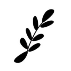
My next step is to make it look like a bush. I have a lot of leaf brushes in my arsenal, but it's very easy to make your own customized ones. Just draw your leaf shape in black on a white background, then go to Edit>Define Brush. It'll show up at the end of whatever brush palette you happen to be on at the moment. Easy peasy. This is my basic fern sort of brush:
See how it's the same on both ends? It's important because I set the brush to "scatter" and also I turn "angle jitter" on, so the brush gets flipped around randomly as I draw with it. I didn't want a bunch of stems sticking out (although sometimes it's a neat effect) so some kind of symmetry was important.
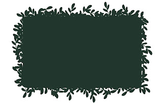
So, I select my nifty brush and go around the edges of my rectangle with it, careful not to let too much or too little show. I'm still using the darkest colour at this point.

I don't really like how all of these guys ended up scattering around the edges, but I'm not going to worry about it right now. It might be good later when I get the other layers on. I'll also turn off scattering and jitter occasionally to pinpoint an area that needs it.
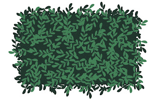
Okay, my basic layer is done, so I'll select the next darkest color and hit it again with the same brush:
Here you can really see the scatter effect of the brush. I have my pen pressure determine the amount of scattering, I'd definitely take advantage of this if you're working on a tablet.
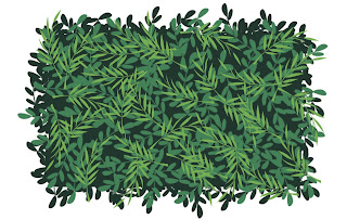
For the next layer, I'll choose a different brush to mix it up a little. I went with a sort of wispy frond brush, and sized it bigger than the one previous. Choose the next darkest colour and...

Oh yeah, I like that! I'm just going for good pattern and shape here, definitely not realism. Some of these little leaves and stems are really bugging me, so I'll take my eraser and clean up what I don't like.
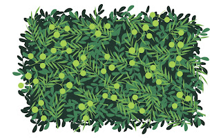
For the last step, I want to choose a fun brush that will be, well, fun. It's a fun little decorative element that makes it have personality. I went with a nice berry-like brush for my lightest colour. I didn't want too much, though, or else it would look too over-done. If they're on different layers, though, you can go back and tweak as much as you like.

And here is the final product!
Hooray! It's a bush. I like it!

Here's a sneaky peek at the same process applied to trees:


Fun shapes extend to the trunks. You can also see there is a lot less contrast in the palette for the leaves.

Next time: more characters!

Cast of Characters - Maddie Bourne


Let me introduce you to our spunky young heroine, Maddie! (Apparently, we like the spunky.)

Maddie is the granddaughter of Ridley and Emma Bourne. She is a precocious 6 year old with a big imagination, always creating fantastical worlds and characters in her notebook, three of which have already been introduced. She is a dreamer and a very curious child. At the beginning of our story, Maddie is afraid of her scarred grandfather, but then learns to love the stories behind the scars. Their mutual love of storytelling brings them close together, and she eventually grows up to be a writer.

Maddie's character design is fairly straightforward. She is growing up in England in the 50s, but we wanted her clothing design to be of the period but also a little more timeless. She wears a very simple dress with a peter pan collar and little mary janes, which could work in other time periods. Her short bob reflects her adventerous spirit, instead of dealing with a more fussy long style. She's a very expressive child, and very cute! I really fell in love with her, and I think Durwin has as well.

In other PFS news, we've been working on developing a style for our backgrounds. We've been looking at old Disney for illustration, and a recent trip to Disneyland was very inspirational. We've been looking at things like Sleeping Beauty and the work of Mary Blair (my most favorite illustrator ever), and have been working on tree and background designs based more on shape and pattern than realism. It's coming along really great. Actually, I'm a little bit in love with it as well (there's a lot of love in this studio!). I'm going to create a process demo soon to show you how it's done. In the meantime, stay tuned for more character introductions!

Friday, August 7, 2009

Cast of Characters - The Woodsman


In Maddie's imagination, the Woodsman exists to protect the Princess. He has a brave soul and a courageous heart (which is captured by the Princess). He's a man of action capable of taking on dragons and trolls alike. In the end, his derring do will allow him to slay dragons, but his decency will also allow him to create unexpected friends.

His costuming is pretty simple: tunic, cloak, and axe. It reflects his humble occupation. However, he will eventually elevate his rank, and inherit an elaborate suit of armor. We tried to keep his facial features angular and his hair a bit shaggy (dare I say Beck-tastic?). Since he appears in many scenes with Scars, Guin and I wanted the Woodsman's angularity to counterpoint the Troll's broad silhouette.

This wraps up the major players for the fairy tale. Next up, Maddie's family!

Wednesday, August 5, 2009

Cast of Characters - The Princess

Here's another introduction – we're slowly making our way down the list.

Let me introduce you to the Princess. She's the dear friend of Scars, and lives in the land of Maddie's imagination (whom you'll meet later!). Beautiful, kind and resourceful, she is the target of an evil presence in the enchanted forest, and must rely on the help of her friends. For character design notes, she's got some interesting features to her hair and costume design that make for really great silhouettes. Her hair starts out in braids which come undone as her trials escalate, and an interesting dress design inspired by tulips. She makes me think of a tulip: vibrant, beautiful, but not overly delicate or in need of special gloves to handle.

I really enjoy this character. I really wanted to make sure our princess character wasn't just some damsel in distress, but is her own person. I remember reading a fantastic series of princess stories growing up where the princesses were resourceful, sassy, kind, and funny, and they were infinitely more interesting than the ones who laid around waiting for a prince to show up. Even though she isn't the main focus of the story, I really hope some of that spunk made it into ours!

Monday, August 3, 2009

Cast of Characters - Scars the Troll


So as you may have heard, Guin and I are working on an all-ages comic for Archaia Studio Press entitled Beautiful Scars. We will be using this Blog to invite everyone out there to join in the fun us as this project gets finished.

But for now, it's my job to introduce you to the characters.

Scars the Troll is the title character. He's a rough and tumble character with a heart of gold. As far his character design notes: he's a big character with spikey bits to make him seem more ferocious. However, he does wear ribbons in his hair, so he's kind of a softie! BTW, I feel that sideburns are like a character design good luck charm... it worked for Wolverine.

It is Scars' job to protect the Princess in Maddie's imagination. More to follow!

Sunday, August 2, 2009

2009 SDCC Portrait Challenge

Guin and I have this game where we'll draw shapes and the other artist will turn it into something. It's a lot of fun if you've never tried and especially great in restaurants where the table cloth is paper and the crayons are plentiful.

At San Diego Comic Con this year, people walked up to me to check out A.) My Cintiq tablet, B.) Sketchbook Pro and finally C.) BEAUTIFUL SCARS which I was working on. To explain A and B, it seemed demos made the most sense, so I accepted the Portrait Challenge:

Rules–The observer drew a shape on the Cintiq. The wilder the better. I then created a layer in Sketchbook Pro and turned it into a portrait. I gave myself no more than 3 minutes to complete the image. Think con sketches but digital.

This made the weekend go by a little quicker with a little more fun! Next year, I plan to do the same. Enjoy!